

Charts-The Basics
This little article is not for seasoned mariners.
It's for those who know nothing, stumble upon this site and look at the charts. Pretty they are too...but what do all the figures mean ?
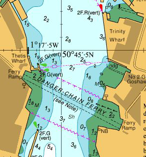
Using charts, bit different from maps. The numbers are depths in metres and decimetres, below chart datum. If underlined and normally on a green bit, it means height above chart datum. Green bits indicate bits of seabed that cover and uncover as tide comes in and out. Brown bits are land and don't cover.
Chart datum on UKHO charts is the lowest tide likely to occur, ever.
So the depth shown on the charts is the least depth likely to ever be encountered at that spot. In practice you will always have MORE depth than shown, and that extra depth can be calculated by reference to tide tables and tidal curves.
Try an example... here is a tide table extract (in GMT)
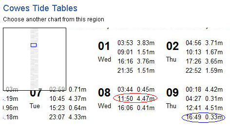
Where the chain ferry runs, the green bits have figures like 2.2 underlined...that height is ABOVE datum. Now have a look at the tide table for 8th October, you'll see that at 11.50 GMT (that 12.50 BST), tide height is 4.47 m. 4.47 less 2.2 gives 2.27m and thats how deep it is at that spot at that time.
Now have a look at Thursday 9th 16.49 GMT, circled in blue on the tide table. Its LOW tide but even at low tide the height is still 0.33 ABOVE chart datum. So same example 2.2m above CD, LESS 0.33m gives a drying height of 1.87m. at that time.
Hope this helps explain, it's essential to understand how charts work if going on the water.
Same info applies if planning a forage on the foreshore, which for safety reasons should be planned for when the tide is dropping, not rising.
There is a wealth of other information embedded in a proper marine chart, but beyond the scope of this little primer.